Simplifying Approval Processes: Enhancing Visibility and Usability of Payables Approvals in BILL
01 · Overview
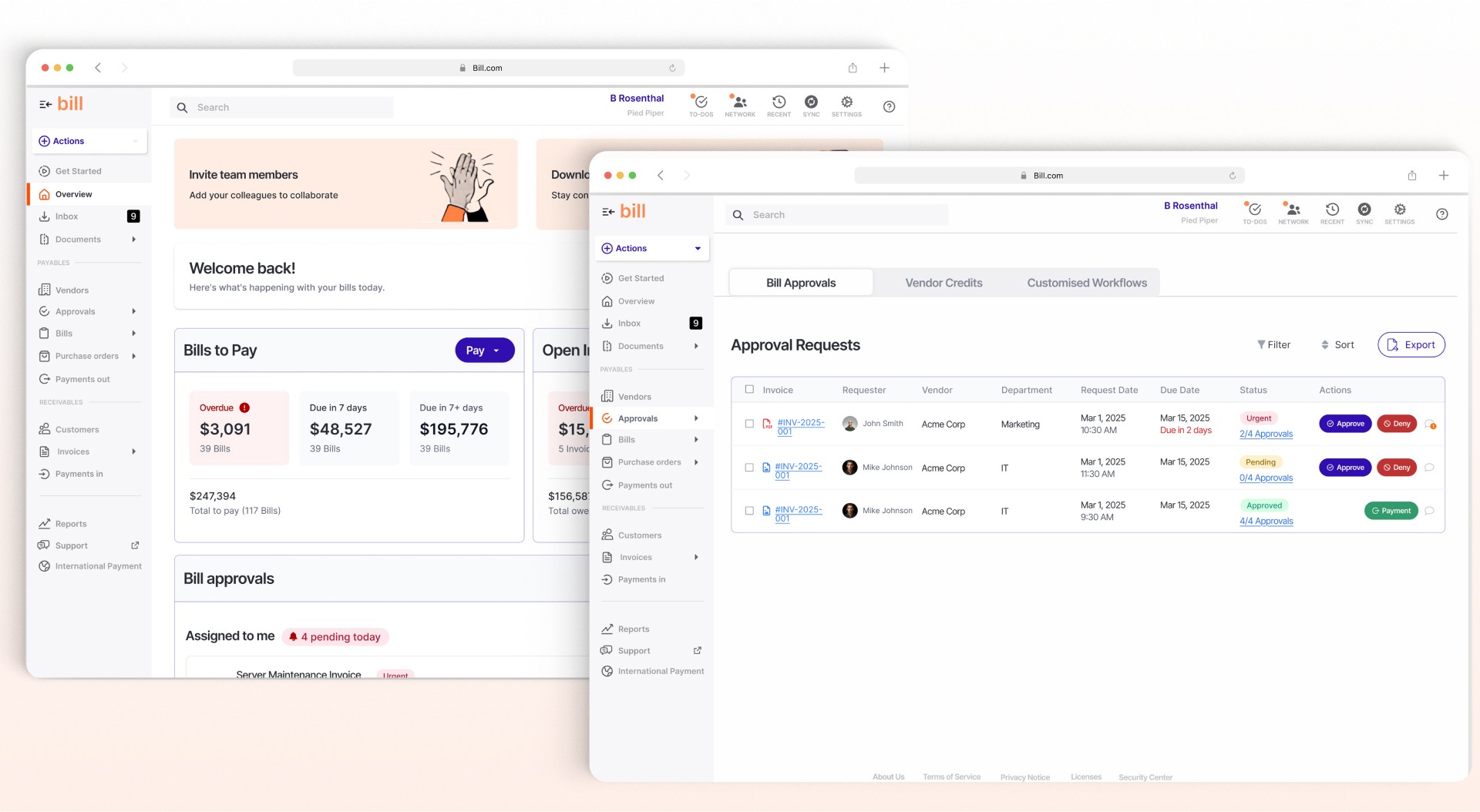
BILL automates financial operations and invoice approvals for businesses
BILL is a cloud-based financial operations platform that automates accounts payable and receivable processes for businesses, ensuring accuracy, compliance, and efficiency in invoice approvals and payments.
Products of Focus
Accounts Payable · Invoice Processing
Automated Bill Approvals · Vendor Payments
Project Details
Duration · 2 weeks
Team · 2 UX/UI Designer
My Role · UX Research, UI/UX Design
Project Scope · Voluntary UX/UI Design Case Study
Tools · Figma, Figjam, UXpilot, Firestudio
02 · The Problem
Approval work lacked clarity, structure, and control
The approval process in BILL lacks clarity, structure, and customisation, making it difficult for users to track progress, understand responsibilities, and manage notifications effectively. Limited filtering options, lack of bulk actions for invoices, and poor organisation of approval requests in the inbox further contribute to delays, inefficiencies, and user frustration.
The Goal
Streamline approvals and give users better control
The goal of the redesigned approval experience is to streamline workflows, enhance clarity, and empower users with better control. By introducing clear status tracking, role-specific task views, custom filters, bulk invoice actions, and an organised inbox, the solution enables faster, more accurate approvals while reducing delays, errors, and user frustration.
03 · My Process
Research-led design without direct access to BILL’s internal systems
The scope and activities of my process vary depending on available resources, project constraints, and access to first-hand data. Since I did not have direct access to BILL’s internal systems, I approached this project through in-depth research, competitive analysis, and user feedback. My process involved studying existing workflows, identifying pain points, and designing an optimised approval experience based on industry best practices.

04 · Discovery
Understanding the approval workflow before redesigning it
The Discovery phase involved collecting and analysing information about BILL’s approval workflow, identifying user pain points, and evaluating competing fintech platforms. Since I did not have direct access to BILL’s platform, I relied on customer reviews, public help and tutorial content, existing BILL interface visuals, and available user feedback to build an accurate understanding of the current process.
Workflow analysis
Mapped the end-to-end approval process, routing rules, notifications, exceptions, and handoffs.
Existing-interface audit
Annotated BILL’s public screens to identify visibility, hierarchy, actionability, and status issues.
Competitive benchmarking
Compared approval patterns across fintech and accounting products to find proven interaction models.
Understanding the Approval Workflow
Before proposing improvements, I needed to understand how BILL’s approval system functions, its limitations, and how people move through it. I focused on the end-to-end workflow, approval routing, the notification system, and the overall user experience.

Current BILL bill-approval process. Select the diagram to inspect the full workflow.
Existing Pages UX/UI Issues Annotation
A close read of the existing interface showed recurring friction: missing workflow visibility, unclear status indicators, weak action priority, limited bulk actions, inconsistent field feedback, and too much back-and-forth between the inbox and individual requests.

Annotated audit of the original BILL experience. Select the artefact to inspect each issue at full size.
05 · Research Synthesis
The real bottleneck was visibility and usability—not missing functionality
As a result of the research, I discovered that the core problem in BILL’s approval process was not a lack of functionality, but a lack of usability, visibility, and control. The system was feature-rich, yet users could struggle to track approvals, navigate rigid workflows, and manage ineffective notifications. This shifted the focus from adding features to improving clarity, streamlining interactions, and creating a more intuitive approval experience.
Lack of visibility
Users struggle to track pending approvals, leading to delays and confusion.
Rigid workflows
The system lacks flexibility when approval chains change or an approver is unavailable.
Notification inefficiencies
Excessive yet ineffective notifications can cause missed approvals and manual follow-ups.
Invoice creation friction
Navigating approvals, reviewing invoices, and taking action is not always intuitive.
Limited exception handling
Editing or rerouting bills after submission requires unnecessary workarounds.
Control deficiencies
Users lack confidence and control because the approval state is difficult to read at a glance.
Competitive Analysis
To benchmark BILL’s approval workflow against industry standards, I analysed competing platforms to identify strengths and gaps. Competitors offered clearer progress indicators, email or mobile approvals, role-based views, real-time status, stronger integrations, and more flexible rule-based routing.

Benchmarking connected the interface-level issues to three systemic gaps: visibility, usability, and control.
06 · Personas and Journey Mapping
Two working personas helped test the workflow from both sides
I created two working personas from the secondary research: an initiator who uploads and routes invoices, and an approver who reviews them at volume. These are assumption-based design tools—not interview-derived personas—and they helped keep the redesign focused on distinct responsibilities, goals, and failure points.
Sarah Thompson · Initiator
Regularly uploads invoices from multiple vendors, sets approval workflows, and tracks statuses. Goal: efficiently upload, route, and track invoices.
Mark Reynolds · Approver
Reviews invoices for timeliness, compliance, and accuracy across departments. Goal: quickly approve or reject at volume without errors.
Mapping the User Journey
The journey-mapping exercise focused on three questions: where approvals tend to get delayed, how notifications affect the workflow, and where users need better visibility and control.

Working personas and journey maps for the initiator and approver roles. Select to inspect the stages and pain points.
Approval state
People needed to see who had acted, who was next, and where a bill was blocked.
Action priority
Urgent and assigned work needed stronger hierarchy than a flat list could provide.
Batch efficiency
High-volume users needed filtering and bulk actions without repeatedly returning to the inbox.
Confidence
Reviewers needed context, history, notes, and checklists in the same decision-making view.
07 · Ideation & Planning
Prioritising clarity, control, and flexibility
With a clear understanding of BILL’s approval workflow, user pain points, and industry benchmarks, I identified visibility and usability as the core issues impacting efficiency. I then explored ways to simplify the process, enhance user control, and retain the flexibility needed for different organisational workflows.
How might we
How might we make approvals easier to understand and act on?
Reduce approval bottlenecks with clearer tracking and escalation paths; improve notification relevance and prioritisation; enhance approval-dashboard filtering and control; and introduce a more intuitive workflow for exception handling.
Visibility first
Show approval status, ownership, next steps, and blockers without requiring users to open every item.
Role-specific views
Give initiators and approvers task views designed around their different responsibilities.
Bulk efficiency
Support filters and multi-select actions for high-volume invoice and approval work.
Exception control
Make rerouting, skipping, pausing, and changing approvers visible and explainable.

Impact-effort prioritisation and reference analysis used to choose the most valuable interaction improvements.
08 · Refined User Flows
Defining the interaction logic before visual design
To bring the ideas to life, I mapped clear user flows across the key approval stages. Multiple iterations helped simplify the journey and establish the structure for the high-fidelity prototype.
Simplifying navigation
Reduce complexity in approval decision-making and make the next action easier to locate.
Enhancing visibility
Add structured dashboards, clear status, ownership, and progress tracking.
Improving interactions
Streamline invoice review, task actions, comments, and exception handling.

The initiator and approver flows defined routing, review, exception, and decision states before visual design.
Flow outcome
A shared structure for two distinct roles
The refined flows laid the foundation for interface exploration, high-fidelity prototyping, and usability validation in the next phase.
09 · Design & Rapid Prototyping
Translating prioritised solutions into seven redesigned screens
Rapid prototyping enabled early validation of the design decisions and turned the flows into a tangible, testable experience. I used the most current BILL design system I could reconstruct from public screenshots and branding guidelines so the new interactions remained consistent with the existing product ecosystem.
Bringing the Designs to Life
The redesign focused on three principles: streamlining workflows so users could act faster, enhancing visibility and prioritisation so cognitive load was reduced, and aligning new patterns with the existing BILL interface so the concept felt familiar.

Three design principles guided the high-fidelity work.
Designed Screens
The final prototype covered seven connected experiences: the dashboard, approver breakdown, inbox, approval requests, create bill, exception handling, and review bill. Each addressed a specific visibility or control problem found during discovery.
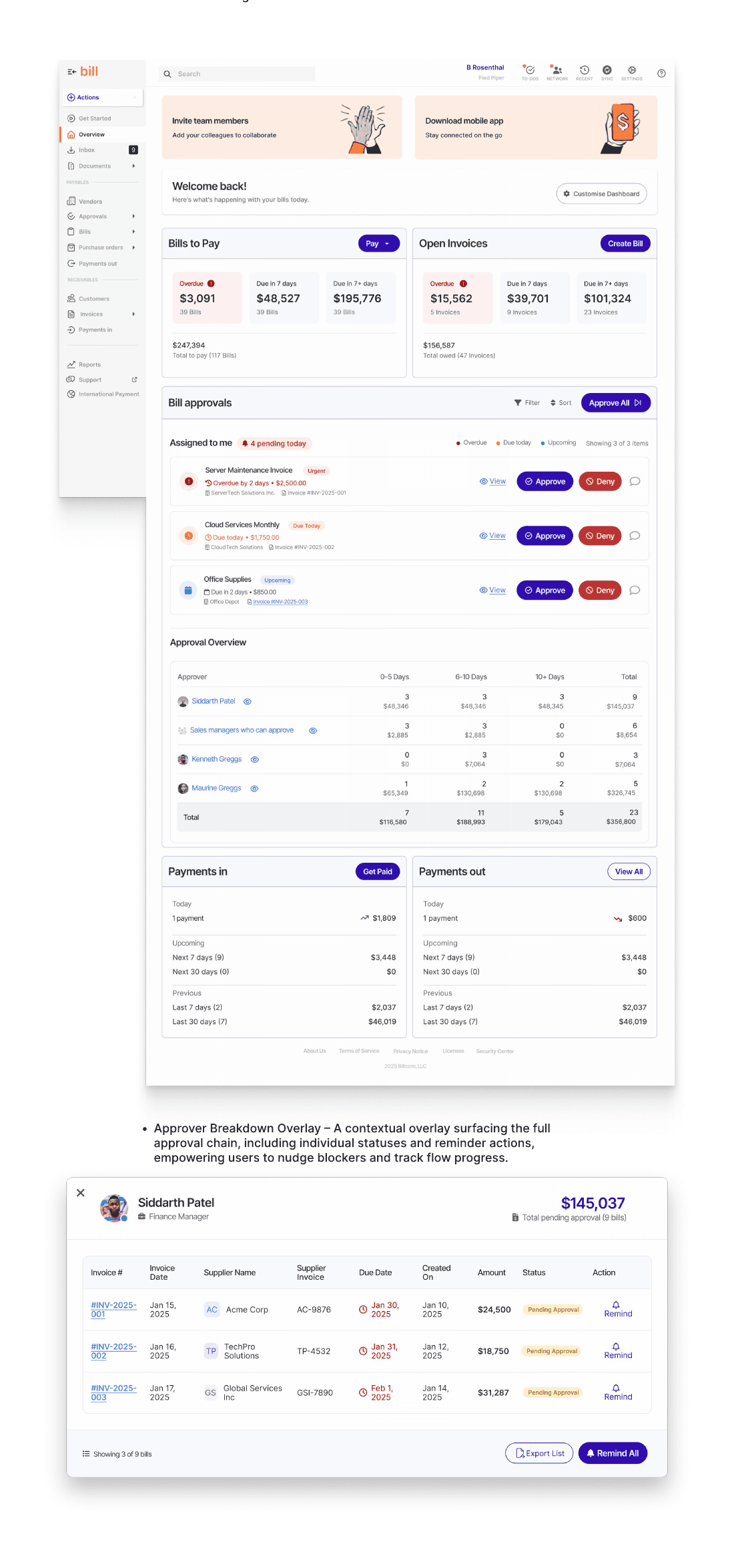
Dashboard: a role-based command centre with KPI tiles, pending approvals, urgent invoices, and timeline tracking. Approver breakdown: the full approval chain, individual statuses, and reminder actions.

Inbox: a dual-pane workspace for quick sorting, invoice context, and one-click approvals. Approval requests: a filterable hub for status, priority, responsibility, and batch decisions.

Create bill: guided entry and contextual approvers. Exception handling: visible workflow deviations. Review bill: decision actions, audit history, checklist, and notes in one place.
Design outcome
A system-consistent concept built around decision confidence
The result was a connected approval experience designed to give initiators and approvers greater clarity, confidence, and control across both routine and exceptional cases.
10 · Usability Testing
High completion exposed friction that success rate alone could not show
To validate the redesigned approval experience, we conducted structured, screen-based usability tests in Maze. The goal was to measure task completion, identify interaction friction, and collect qualitative feedback from participants with fintech and invoice-processing backgrounds.
Test Setup
The interactive prototype simulated realistic scenarios across both initiator and approver roles. Participants reviewed and approved invoices, created and submitted bills, configured workflows, handled exceptions, and explored the interface freely.
01 · Review high-priority invoice
Test visibility and prioritisation of invoices.
02 · Create and submit bill
Evaluate the intuitiveness of bill creation.
03 · Handle approval exception
Observe exception identification and resolution.
04 · Review submitted invoice
Assess information recall and audit history.
05 · Edit approval workflow
Test flexibility and ease of workflow configuration.
06 · Explore interface freely
Capture first impressions and detect usability issues.
Usability Test Results
Five of the six flows achieved 100% task completion. Users finished quickly, with average task durations between 5 and 29 seconds. The completion data looked strong, but the misclick and drop-off data showed that several interactions still required better guidance.
5 of 6 flows
100% task completion.
View and act
100% completion, but a 60.8% misclick rate.
Configure workflow
100% completion, with a 40% misclick rate.
Review bill
83.3% completion, 35.5% misclicks, and 16.7% drop-off.

The test plan, task results, interaction traces, and feedback analysis. Select to inspect the evidence at full size.
What the numbers meant
The prototype worked, but parts of it were not obvious yet
Completion measured whether participants could finish. Misclicks measured whether the path felt clear. The biggest opportunities were workflow guidance, clearer filtering and batch-action feedback, and reducing cognitive load in the Create Bill form.
Design Comparison: Old vs. New
The redesign introduced clearer hierarchy, personalisation, and control across the core workflows. It replaced flat status treatment with visible approval state, added actionability to the inbox and approval hub, and made complex exception and workflow decisions easier to understand.

The redesign focused on four impact areas: inbox and approvals, create bill, exception handling, and workflow configuration.
11 · Reflection
Testing turned a polished concept into a clearer next iteration
The usability test surfaced opportunities for improvement—especially in workflow configuration, where users were unsure about routing logic. Feedback also pointed to clearer batch-action behaviour, better filtering, and lower cognitive load in dense screens such as Create Bill.
Workflow guidance
Add tooltips, logic previews, and stronger explanation around routing decisions.
Batch-action clarity
Make selection state, available actions, and confirmation feedback more explicit.
Filtering and scanning
Help users distinguish invoice types, priorities, ownership, and approval state faster.
Create Bill density
Use collapsible sections and a sticky action footer to reduce cognitive load.
Project Conclusion
This case study began with an ambitious goal: to rethink BILL’s invoice approval experience by enhancing visibility, flexibility, and user efficiency. Through research, workflow mapping, high-fidelity prototyping, and usability testing, I created a connected concept that supports initiators and approvers with greater clarity, confidence, and control.
Scope reminder
A concept redesign—not evidence of shipped product impact
This was a self-initiated two-week study completed without access to BILL’s internal systems, analytics, or product team. The outcomes reported here are prototype-usability findings, not production business metrics.
12 · Key Learnings
Designing for enterprise approvals means designing for confidence
The project deepened my understanding of complex enterprise workflows and the tension between usability, business logic, and trust. It reinforced that a successful interface must make responsibilities, status, and consequences visible before asking users to act.
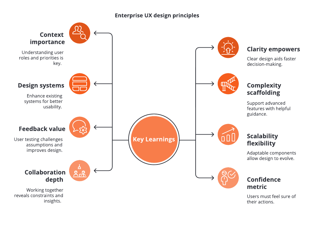
Eight principles from the project, covering context, clarity, design systems, complexity, feedback, scalability, collaboration, and confidence.
Context matters
Understanding user roles, responsibilities, and priorities is essential in approval systems.
Clarity empowers
Visible state and explicit actions help people make faster, safer decisions.
Scaffold complexity
Advanced enterprise workflows need guidance, previews, and progressive disclosure.
Design-system leverage
Improving an existing pattern can create more value than introducing an unrelated one.
Feedback changes the design
Success rates can hide friction; misclicks and qualitative feedback reveal what is not yet intuitive.
Confidence is a metric
Users must understand what will happen and feel sure about the action they are taking.
Next Steps
With the approval experience redesigned, the next phase would extend the same visibility and control principles into invoice management, payout experiences, and advanced approval scenarios.
Invoice management
Simplify intake, validation, and GL coding for faster processing.
Payout experiences
Improve visibility and control over scheduled payments, batching, and exceptions.
Advanced approvals
Support conditional routing, delegation, and cross-team collaboration.
Final direction
Make financial operations faster, smarter, and more human-centred
The next iteration would preserve the strong completion outcomes while improving discoverability, guidance, bulk control, and confidence in advanced flows.